What do the top B2B SaaS websites look like right now?
What are marketing teams using to convert their traffic?
So I did a little research to see if my suspicions were right. Are they offering heavily gated downloads of industry whitepapers?
(Yawn.)
Tons of hastily written, uninformative and unimaginative blog content?
(Woof.)
Or are my dreams coming true as demos dance across home pages of the biggest players in our industry? Pretty please?
Qualtrics
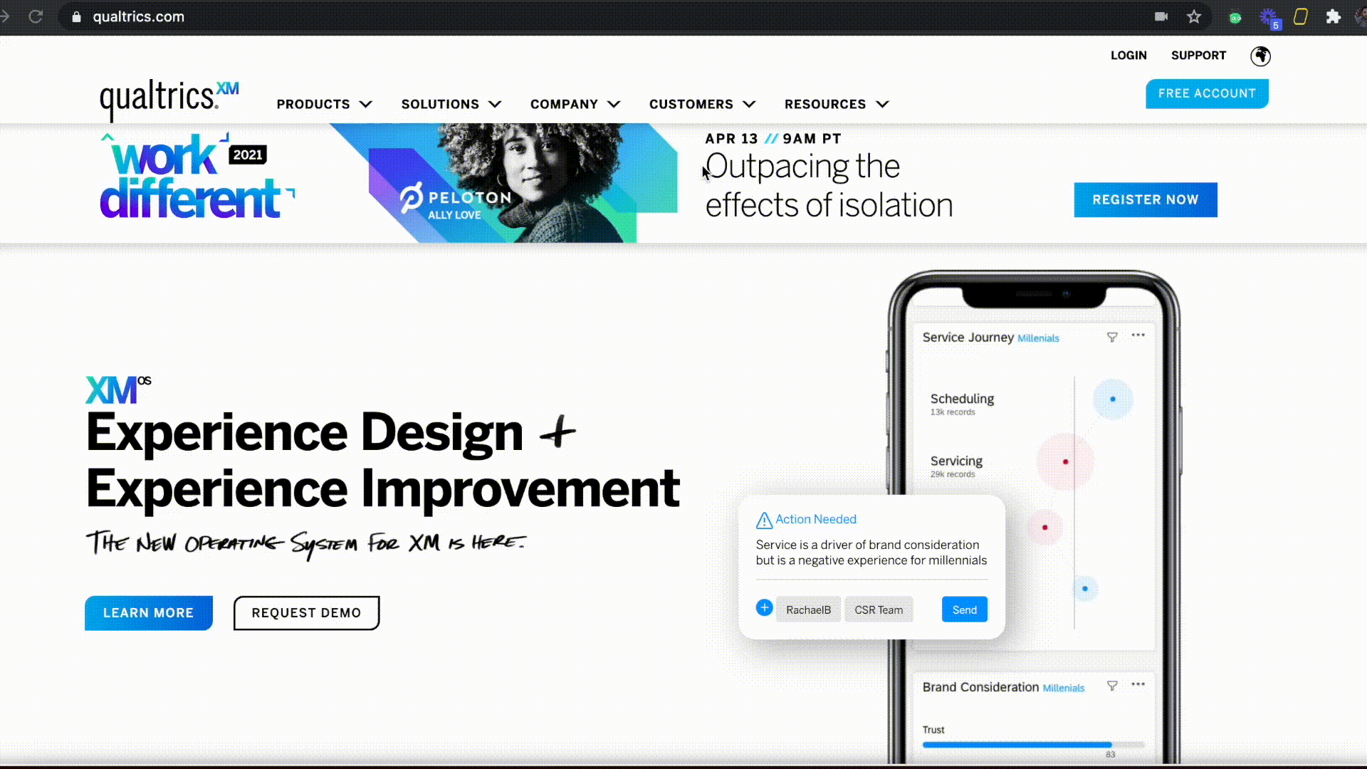
I love the Qualtrics site. Why?
First – the CTA is to get a free account. And they mean it. It’s as simple as Uber or Airbnb.
Put that thing on your phone, try it out, and then delete or keep it. It’s yours.
Second – the lion’s share of the real estate is devoted to a visual representation of their product.
Check that iPhone and the “auto-demo” set up they’ve created here.
Gaze at their homepage for a mere 15 seconds and you know A) what they do B) how to get started.
It’s stupid simple. Like it should be.
Slack
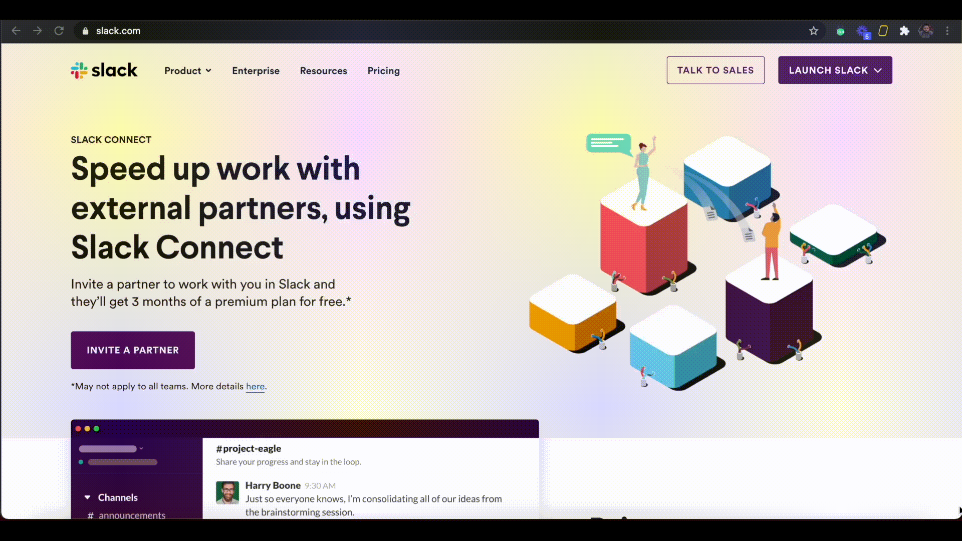
Slack is another fantastic example (although you’ll probably have to go incognito to see what a new user experiences).
Check their CTA, for example: try for free. It’s loud and proud and what they lead with.
I also love the secondary CTA, which is often noted by a transparent box next to the colored-in box. It says Talk to Sales.
Slack gets it – some people want to go it alone and others want a sales touch. Offer both so they can choose. It’s easy.
Scroll down half a screen and you can see exactly what Slack does. This is the new answer to marketing home pages.
Put the menu on the outside wall of your menu so people can browse at their leisure without having to walk inside.
Atlassian
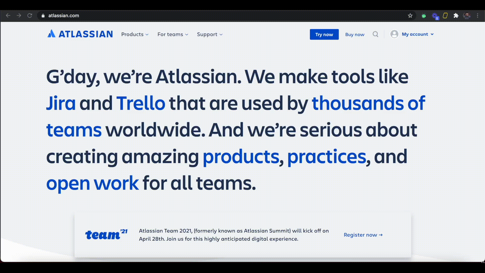
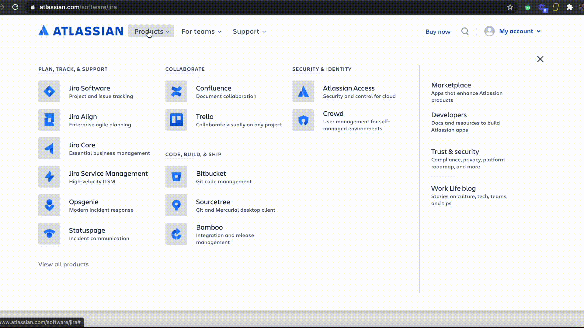
Here’s a two-for-one.
Atlassian is best known for products like Jira and Trello, so that’s what they tell you in one-hundred-point font as soon as you arrive on the site.
Then you can click into one of those products and get the second view.
All pages come with very clear CTAs to buy or try the product.
As you scroll down, they’ve used screenshots to create a “demo” of the product.
Keep scrolling to understand exactly how it works.
Key Takeaways
I’m seeing two very clear patterns here:
First – make it obvious what you do. Stop chasing engagement metrics by trapping users into clickholes as they try to learn what you do.
Put it up front and let them grok your concept from the jump.
Second – make your CTAs varied. Sometimes I want my questions answered, and sometimes I just want to shop in peace.
Give me a trial option and a sales option, and let me make the decision myself.
P.S. If your website isn’t up to snuff, call me. In the meantime, check out the work we did for two of my favorite Reprise customers. They used our product to rebuild their website into an informative resource for their prospects and customers. What an idea! Check them out and imagine putting your company’s product front and center….
Photo by Nick Morrison